The brief
By 2020, IELTS was operating 28 separate regional websites, each with its own design, content structure and accessibility standards. Over time this led to duplicated information, inconsistent visual styles and uneven usability across regions, and it diminished trust in the official IELTS experience.
In user interviews we heard the same concern repeatedly. Learners weren't sure which site to follow, how to book a test, or where to find reliable preparation materials. Different journeys and conflicting information created confusion at the moments when clarity mattered most. The challenge was clear: consolidate the experience into one global platform that is consistent, accessible and easy to navigate.
What we did
We took a human-centred approach, combining research, workshops and analytics to understand how users moved through the system. Regional teams helped identify overlaps and gaps, while collaborative design sessions aligned everyone on a shared language of content and interaction.
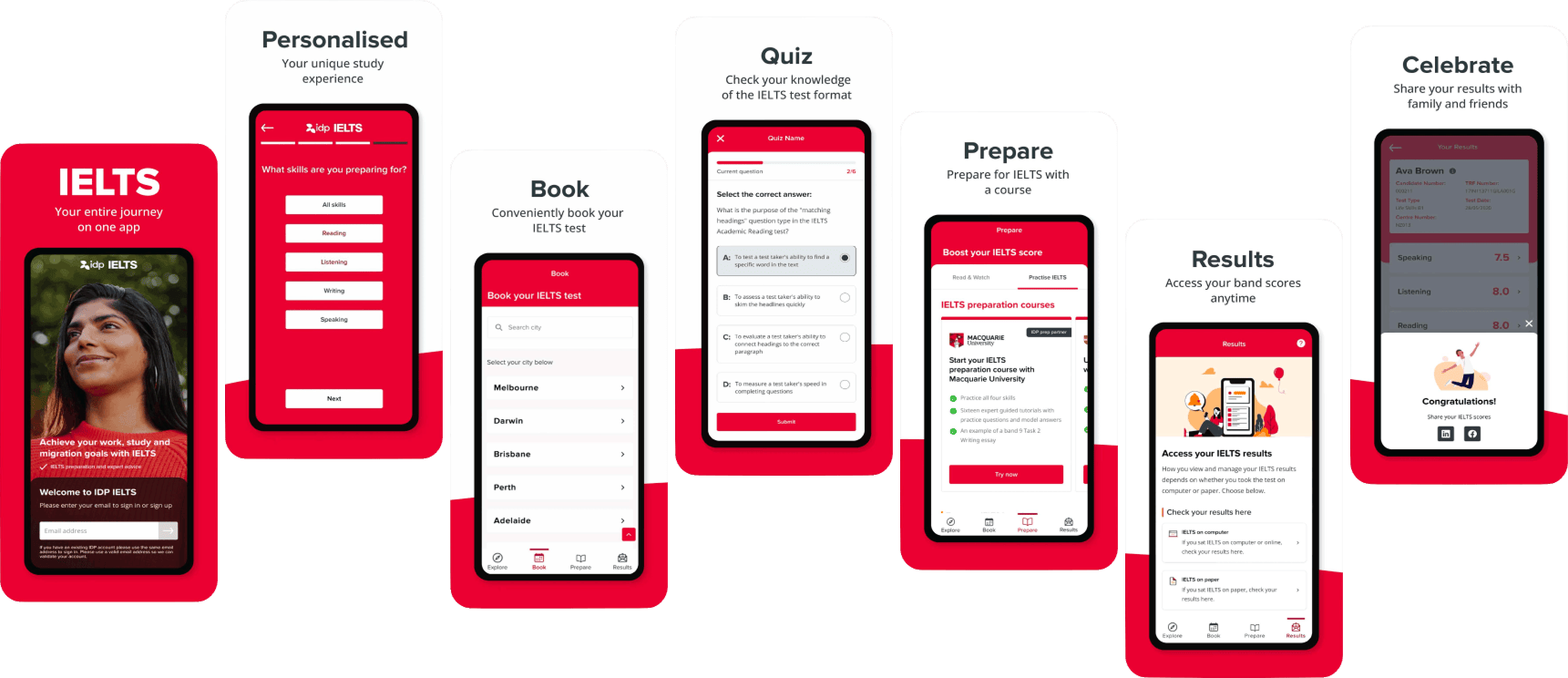
To accelerate decision-making, we led a focused three-day design sprint that shaped the first MVP of the mobile app and validated early user journeys. Through prototyping and iterative testing, we built a single design system that simplified navigation, improved accessibility and unified the brand across platforms, one website and mobile app working together, familiar in structure and distinct in purpose.
The outcome
The new IELTS experience now connects learners, educators and test-takers across the world. The app passed 1M+ downloads within the first months, engagement rose 28% across web and app, and the platform delivers clearer navigation with stronger accessibility compliance.
What was once a scattered network is now a single, trusted platform for learning and progress.