The brief
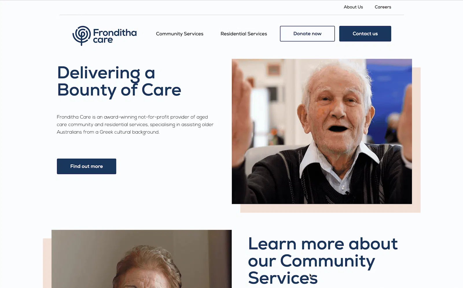
Fronditha Care supports older Australians, especially within Greek and multicultural communities. Families visiting the website often didn't know where to start, the process felt intimidating and emotional. They needed simple language, clear next steps and reassurance that their culture and dignity would be respected.
The existing site was text-heavy and difficult to scan, and key questions went unanswered: Am I eligible? What comes first? How do I talk to someone? The challenge was to make the journey clearer for English and Greek speakers, and to reflect the organisation's values of community, care and belonging.
What we did
We simplified the information architecture and wrote content for how families actually search. A step-by-step pathway showed what to do first, which documents to prepare and how to get help at each stage, while plain-language pages answered eligibility and service questions without jargon.
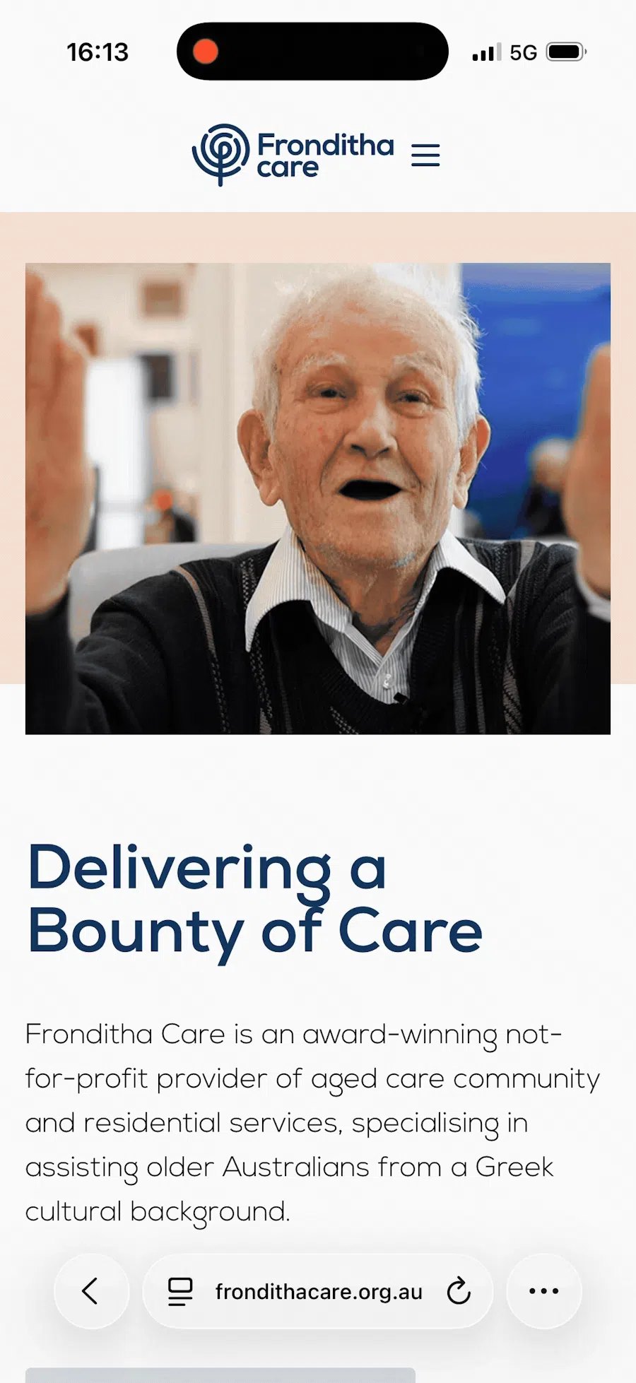
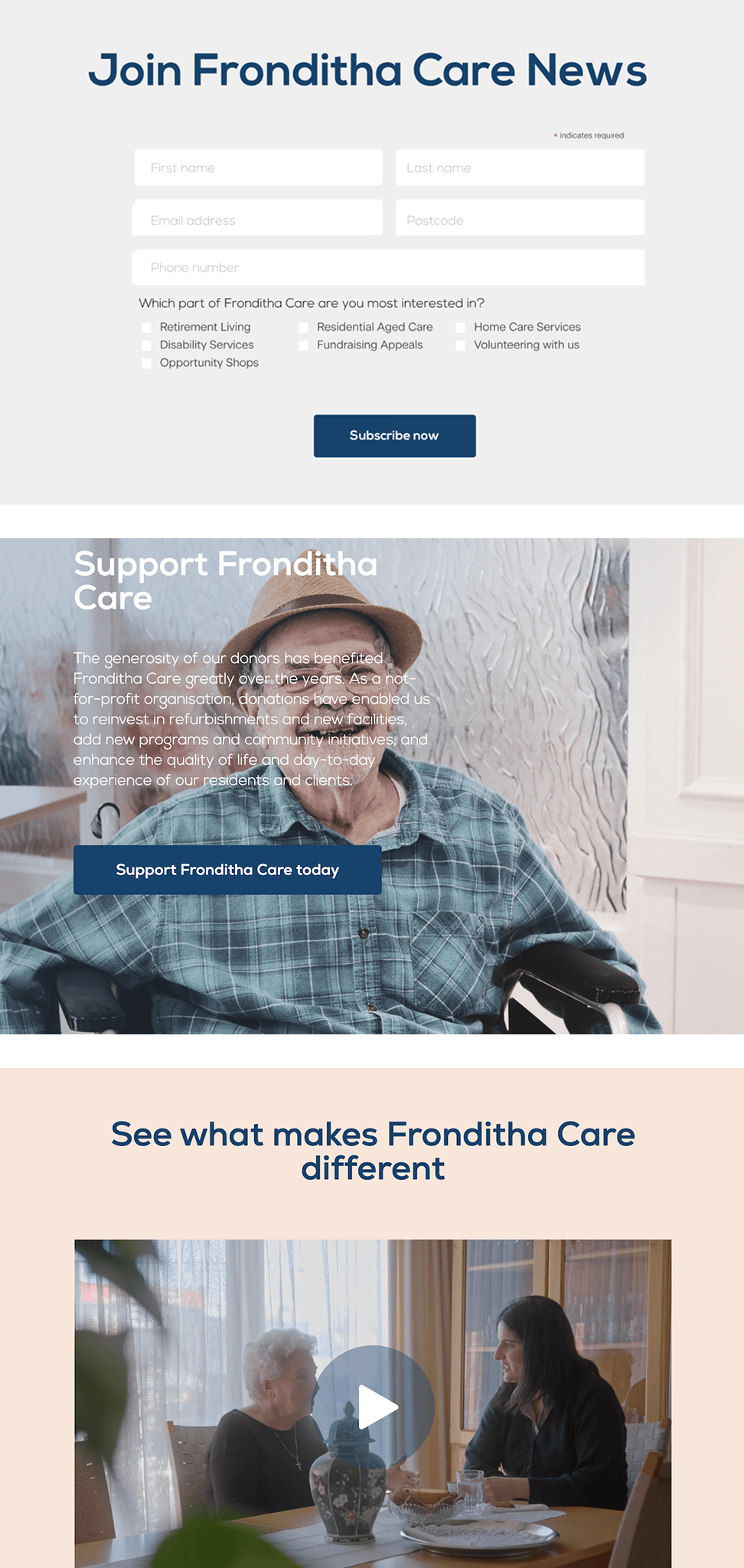
The interface supported bilingual content in English and Greek, with visual cues that felt familiar to the community. We photographed residents to show real people and everyday moments, not stock imagery, and clear calls to action guided visitors to enquire, book a tour, donate or get involved. The design system followed accessibility best practice and worked smoothly on mobile.
The outcome
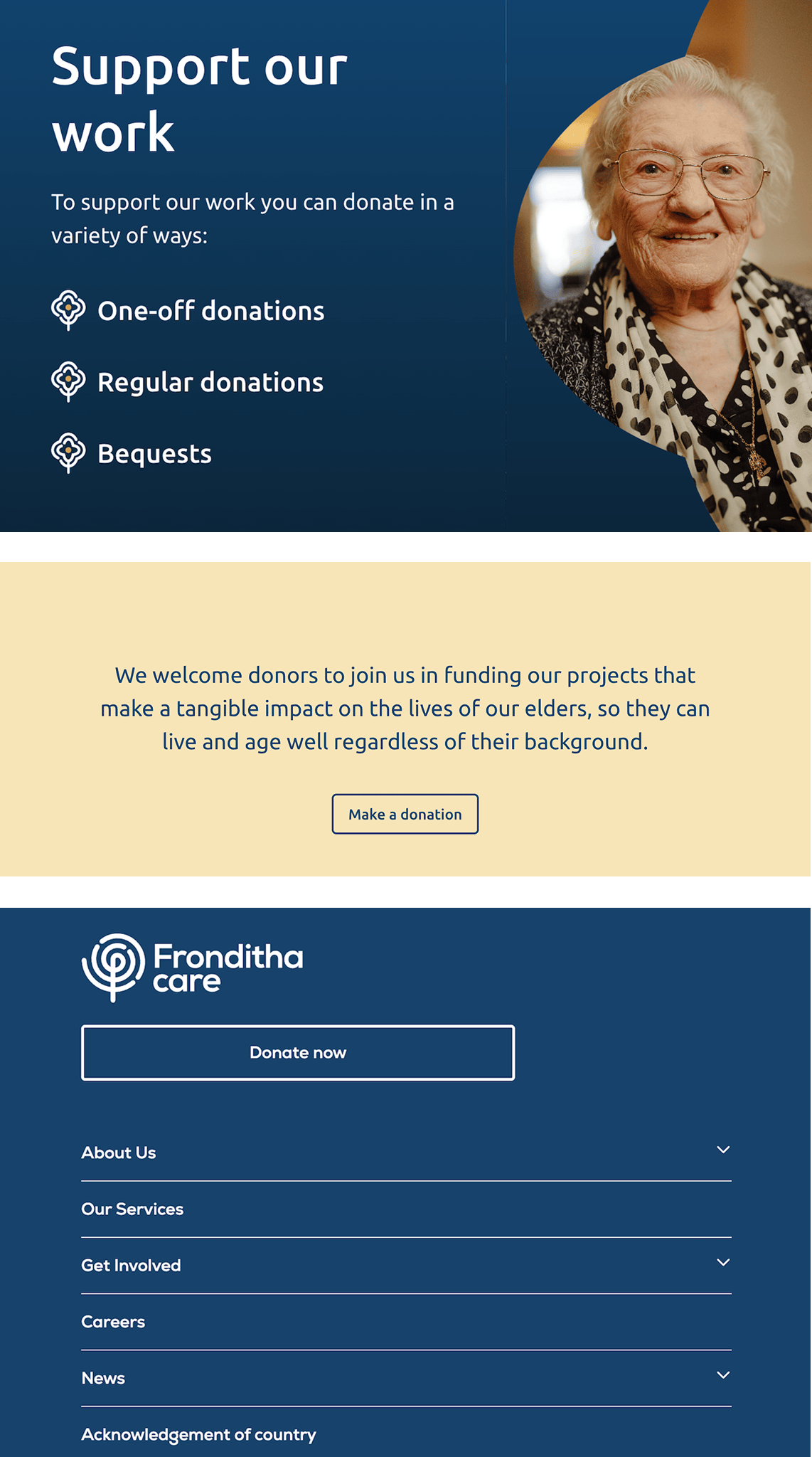
Families now find what they need faster and know how to begin. Staff can direct callers to a single, clear starting point, and a dedicated donations page supports community programs and ongoing care.
The site reflects what matters most to Fronditha Care, dignity, empathy and cultural connection. A place where the journey into care feels understandable, respectful and supported.